Posted by
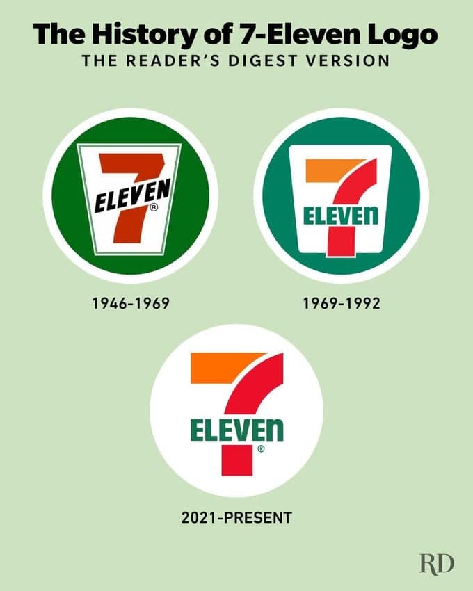
The 7-Eleven logo intentionally uses a lowercase 'n', something the company president's wife said made it look friendlier.
Here’s Why the 7-Eleven Logo Looks Like That
Findings
Additional insights we found via Reader's Digest
The company began using the current stylization—"Eleven" in all caps, except for the "n"—in 1969.
According to Nakia Gray, an intellectual property attorney and brand strategist, the company president's wife believed placing "Eleven" in all caps, as "ELEVEN," was too harsh and that ending on a lowercase would soften the logo.
Likewise, the company has always used the novel "7-Eleven" rather than a more uniform "7-11" to make it more eye-catching.
Similar Posts
Showing 1440 posts similar to “The 7-Eleven logo intentionally uses a lowercase 'n', something the company president's wife said made it look friendlier.”
You've reached the end.