Posted by
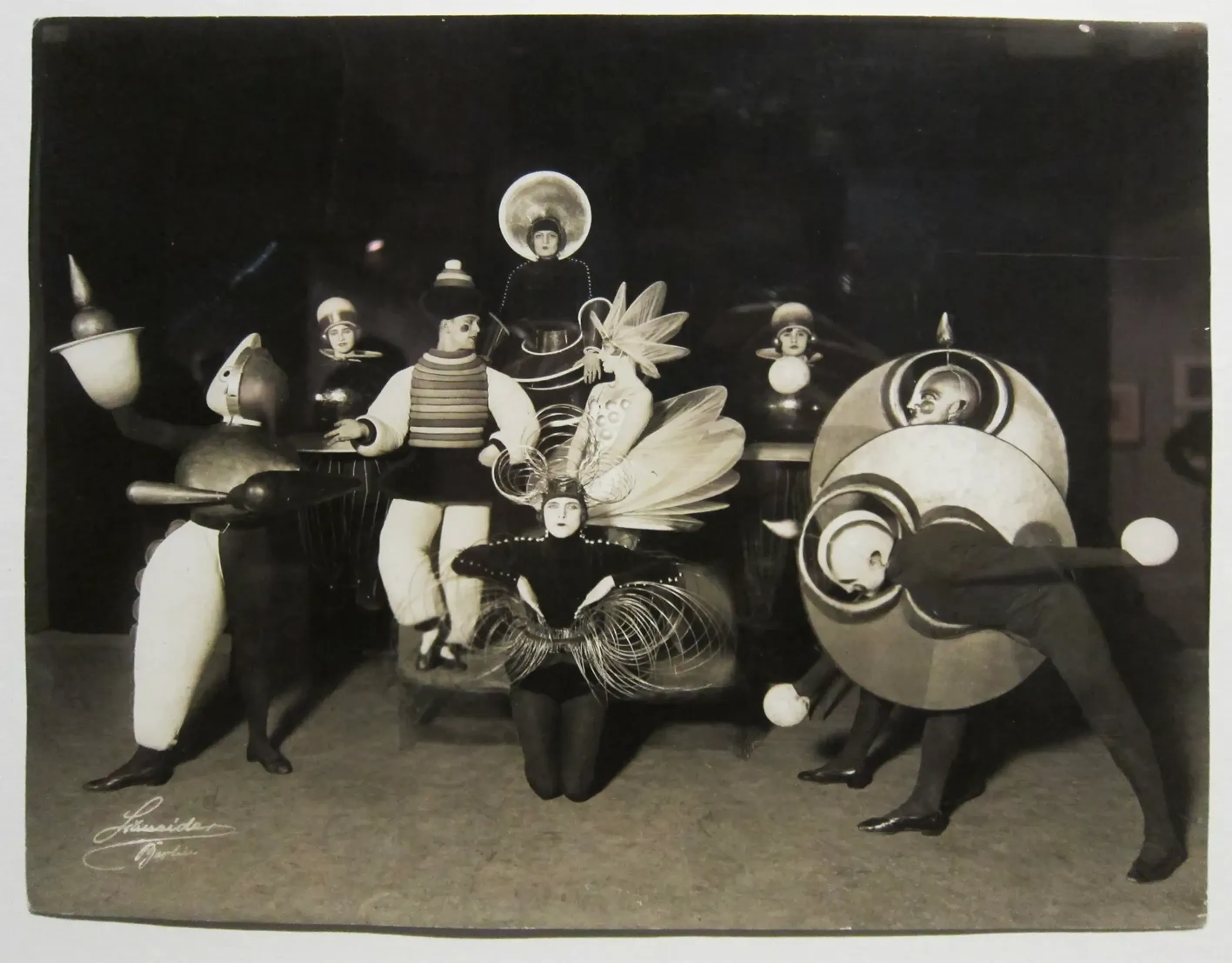
The Bauhaus school developed a sleek typography that intentionally contrasted Nazi propaganda.

Findings
Additional insights we found via Quartz
Following World War I, the Nazi Party used the ornamental Fraktur typeface, hoping to give its materials a classical sheen.
The Bauhaus school responded with a sleeker design style, including bolder, rounder fontfaces.
The Bauhaus style can still be found in widely used typefaces like Helvetica.
Similar Posts
Showing 1440 posts similar to “The Bauhaus school developed a sleek typography that intentionally contrasted Nazi propaganda.”















You've reached the end.